I have mentioned this before but in my twenties I worked for five years for a graphic designer. I had come across a series of very smart, pretty books that he had designed, and being a bookish person, I walked into his studio one day and offered my services. The problem was that I had no skills to speak of and I had never designed anything. I was not a trained architect like a few of the studio staff. I was not an I.T. whiz. I knew a little bit about art and I was good at listening and reading, but beyond that I had nothing specific to offer.
The designer must have been having a good day because he took me on. As an added bonus, the studio sat atop a bakery. The bakery and the studio both grew much bigger a few years later but for a while they were both small and improvisational. The bakery, as it tried new things, often made mistakes and fallen cake tops would be delivered upstairs to the studio. I remember eating many cake tops.
We worked on a variety of interesting projects as a studio: a movie, a museum show, a book, a manifesto, and a font generator. We collaborated with architects, dancers, composers, filmmakers and visual artists. The designer introduced me to the work of John Cage, Brian Eno, Claes Oldenburg, David Byrne—artists whose roaming adventures took them to the collapsing cliffs of old disciplines. I made good friends. We laughed a lot. The designer was (for the most part) a friendly and funny man, admirable qualities in a boss if you ever need to have one.
Of all the things he made, it was the designer’s approach to book design that really changed the way I thought about form. In each book he made, he aimed to create an object that wasn’t merely an illustration of the content, but rather a model of it. For example, if he was making a book about the city he set out to create something that performed and behaved—with abrasiveness, typographic density, collisions and jumpcuts—like the city itself.
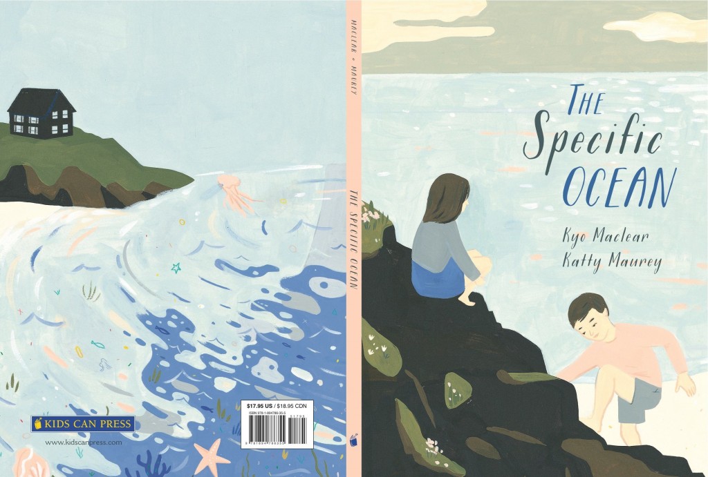
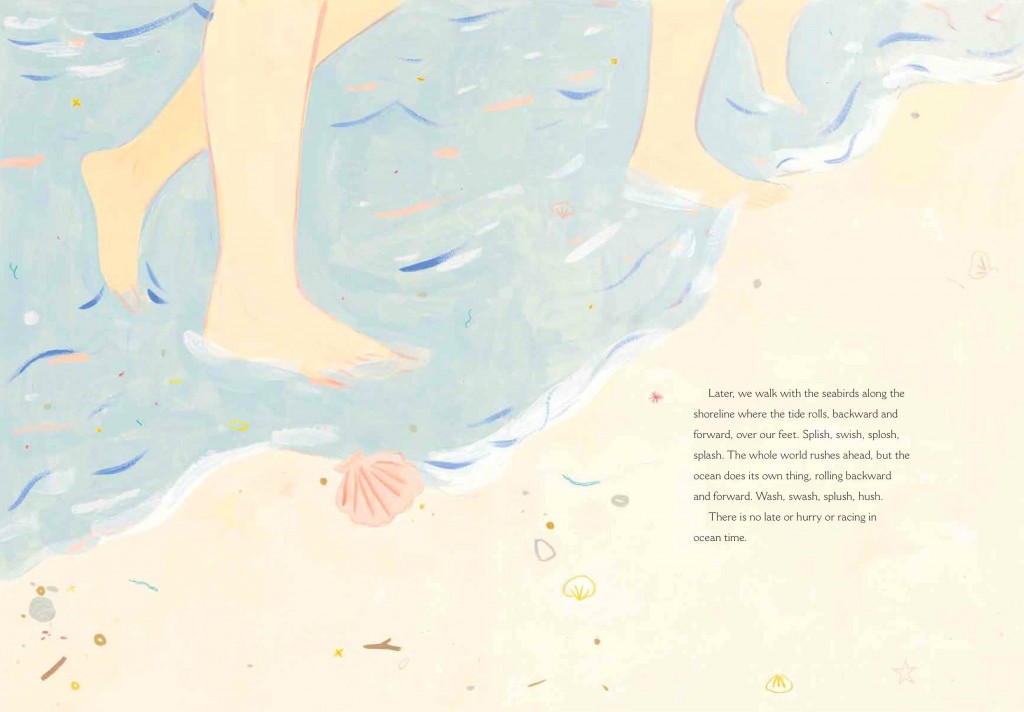
This past year I had the incredible good fortune of working with two book teams that seem to have taken this philosophy of ‘modeling’ to heart. The Specific Ocean (illustrated by Katty Maurey, designed by Karen Powers, and edited by Yvette Ghione) feels, to me, like a dazzling incarnation of the ocean. Opening its pages I can almost smell the salty surf and feel the warm breeze. With its sun-bleached palette and slow visual tempo it fills my heart with seaside happiness.
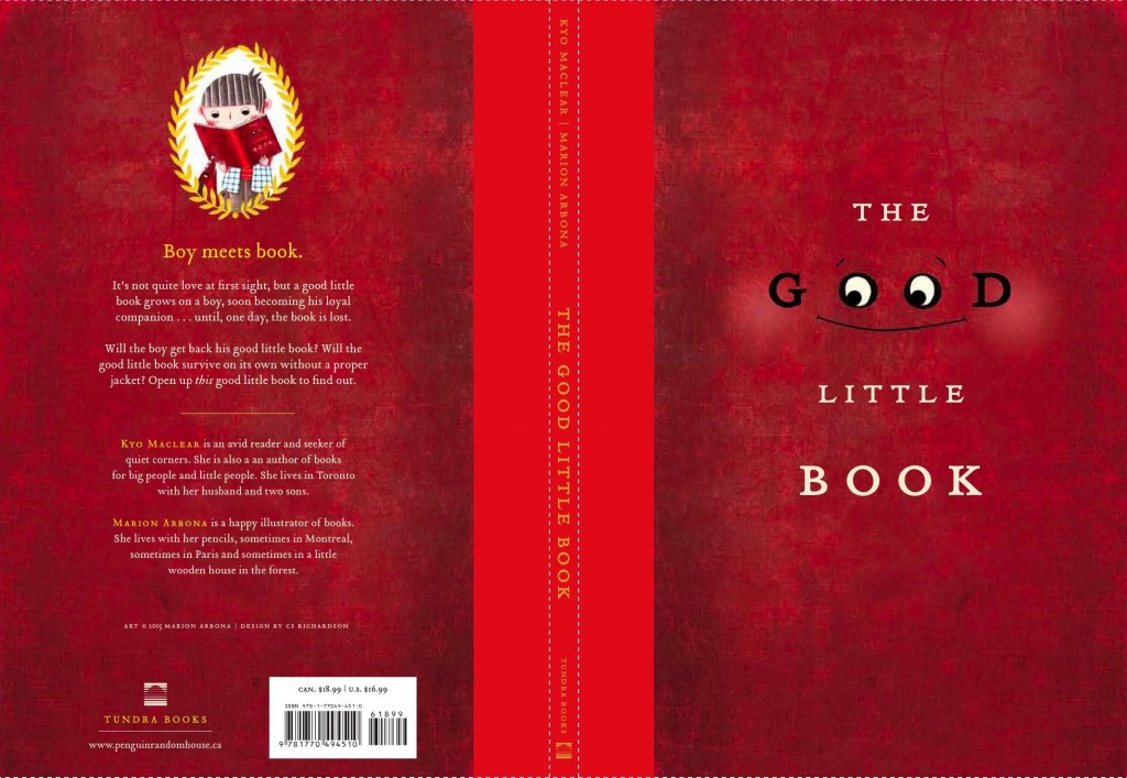
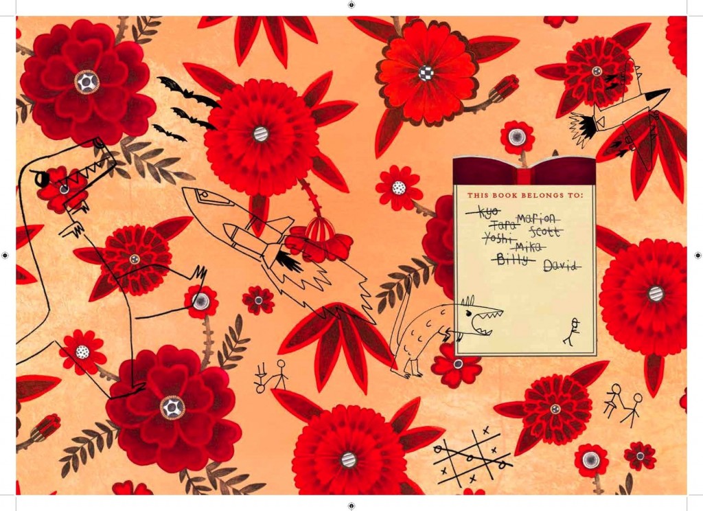
The (soon-to-be-published) second project, The Good Little Book, is the genius creation of Marion Arbona (uber-illustrator), Scott Richardson (master designer/novelist extraordinaire), and Tara Walker (beloved editor.) I adore the look and feel of this book. When I hold it in my hands I have the sense of an object well-worn and loved over time. It immediately transports me to the used bookshops I frequented as a teenage thrift-shopper. From the crowded name-plate to the doodly marginalia to the textured tinge of multiple readings, a whole world of old and lost books is wonderfully evoked.
